3 super-simple ways to do sales analysis
Introduction
In the polls I carried out ‘Sales’ was a topic that small businesses wanted to read about. You can find what I wrote about Social Media and Search by clicking the links. If you are a business owner, you will know that being on top of your sales numbers is a good thing. But I am always surprised at how infrequently some people do it.
Big businesses often suffer from data overload. Some just ignore their data because a) they do not see it as data b) they don’t have the time c) they don’t have the skills. At the other extreme they may suffer analysis paralysis where decisions are not made because of over-thinking and a failure to get behind one single conclusion.
The situation is similar for small business too. They may well have less data, but they also usually have fewer decision-makers too, so are not necessarily at an advantage. They may not have the time or skills too but are also probably less able to hire in an expert to help either.
What I have realised is that because of my background I look at data in a completely different way to other small business owners. I wanted to show that perspective to you and also share you some very simple ways that you can start to understand more deeply what is driving your sales.
A picture paints a thousand words
Lots of businesses produce regular snapshot sales reports that look like this:
Year 1 | Year 2 | Annual change |
164 | 97 | -67 |
It needs a bit of mental effort to figure out if the change is good/bad, big/small.
Here is the same information displayed in a chart:
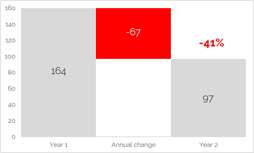
Even if you have never seen this information before you can quickly tell that
- Year 2 is lower than Year 1
- By a lot. Without the % label most people would guess at c.33% (a third)
If you had 50 of those tables to look at to get an overview of how each of your products performed the time investment of setting up charts is probably more than won back by the speed at which you could go through them and draw conclusions. Especially if you learned how to do it quickly with template or automation.
Data charted is not just pretty. It helps enormously with decision-making
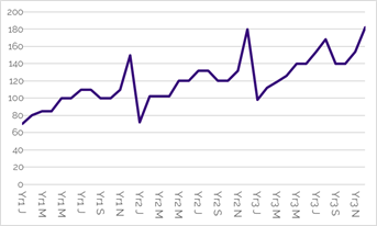
Plot your sales over time
Sales snapshots are great for a quick diagnosis of what needs your attention, but say nothing about longer term trends, cycles, other patterns and what might be driving those. And who can remember what their last 52 weekly snapshots look like if put side by side, you would need to memory of Sheldon Cooper for that!
Here are three ways to start learning what is driving the sales patterns you see:
Period-on-Period
This is a bit of an odd name, I know. But that is just because it is general. It just means rather than looking at your current year/quarter/month/week/day sales in isolation you compare them to what they were last year/quarter/month/week/day. It gives you some context as to whether your current performance is unusual or not. Here is an example of some made up quarterly sales data across two years:
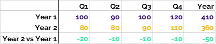
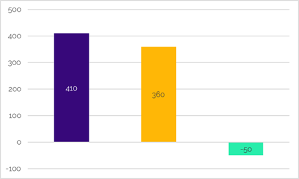
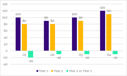
The top table shows the data by quarter and then summed across the year. Year 1 is the first row, year 2 is the 2nd row. The final row is what we are interested in – how Year 2 performs relative to year 1. You can do this for the quarter and year totals.
The first chart plots the yearly data to show that year 2 at 360 is down 5o on year 1, allowing you to start judging if 360 is good or bad. The second chart adds context. That drop of 50 on the year is made up of 20 in Q1 and 10 in the other three quarters. Information that you do not see if you only look at the annual chart.
You may have been expecting year 2 to be down because of what you know about trading conditions. If it is a surprise, the quarterly chart gives you a clue that you may be looking for two explanations. There seems to be a general drop in all quarters and perhaps another adverse effect in Q1.
You need hold your nerve with period on period. For example, if you did a big marketing campaign in year 1 but did not repeat it in year 2 this could be the explanation for why sales are particularly lower in Q1. If that was your only difference between the Q1s you have a simple read on your Q1 marketing effect in year 1.
And the fact that there seems to be a drop that affects all quarters is interesting too. That suggests that something has altered your trading position permanently. That is worth investigating because it may be due to something in your control that you can tweak to reverse the decline.
Period-on-period helps you to put performance in context & highlights temporary from permanent changes in sales
Seasonality
This takes looking at relative sales performance a step further to try to work out what you would expect sales to be without you trying to drive them. For example, if you sold ice cream, people typically buy more in the summer when the weather is hot. In fact, temperature and an ice cream sales graphs might look similar. If you can get to this, you can use it to:
- create a forecast of what next year sales might look like before you do any activities designed to push sales higher
- decide where to place marketing activities to take advantage of when there are naturally more people in the market to buy
There can be a bit of analyst snobbery about the true definition of seasonality. Purists will argue that seasonality is only accurate if you strip out everything else other than natural market potential, but that needs modelling. Pragmatists like me say that you can get a long way to understanding without needing a statistician.
If you are looking to find your yearly pattern of seasonality you need at least three years of data. One year will give you a rough idea but you will not really know what sales were driven by what you did vs those you would have got anyway. Two is better but there is still a chance that one or other of the years was abnormal. 2020…
Three years of monthly made-up sales data & how to create a seasonal index:
- Put the yearly data side by side in a table in Excel or Google Sheets and calculate the average for each month =AVERAGE(number1,number2,number3)
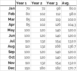
- Turn the average column to an index. An index is just a set of data where the average = 100 (or 1, you can choose any “base” you like.) It means that you can then read the monthly figures as how far above or below average they are.
You do this by:
- calculating the yearly average of the average column (119.6)
- dividing each of the months by that yearly average (see below)
- multiplying those figures by 100 for each month (see below)
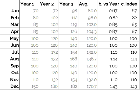
This is the January calculation: = 80 / 199.6 x 100 = 67. January sales are only 67% of the yearly average. Or 33% lower than the yearly average. But December is 43% higher.
What to do with it? If you had a target of 1,600 for next years’ sales, you could create a monthly target by taking 133 (1,600 / 12) and then multiplying by the index for each month. If you add those monthly targets together you get to 1,600 but you are being more realistic in what can be achieved each month based on experience.
You could also consider running promotions in January to encourage more sales. Or not overspending on marketing in December because that seems to be a typically good month anyway. If you have always done a campaign in December think about testing spending less to figure out what is being driven by the market, not you.
Start tracking actual monthly performance against that target for an early warning system of when something is unusual. Review and recalculate your seasonal index every few years – when it is quite accurate it will not change much but it tends to when new competitors come into your market or consumer habits change.
Seasonality helps you to form expectations about the level of sales over time, and to plan activities at times when they will be most beneficial
Plotting sales vs activities
No calculations here. Just a simple chart over time of your sales against the marketing activity you do, what competitors do, when you launch new things etc. Getting into the habit of forming ideas of which business actions you take are the ones that seem to be driving your pattern in sales.
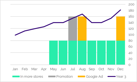
A chart proves nothing, but it can direct your attention to where it is most needed. Or stop you from continuing to believe something is true when there is no evidence to support that belief. If you want to get fancy you can calculate something called the correlation coefficient between two sets of data that are over the same time span. Here are the correlation coefficients for the 3 activities in the chart above each against Year 3 sales =CORREL(series 1, series 2) in Excel:
| In more stores | Promotion | Google Ad | |
| Year 3 sales | 80% | 19% | 70% |
Correlation coefficients are between -1 and 1. The closer the number is to 0 (positive or negative) the weaker the link between the two things. But coefficients close to -1 or 1 indicate a strong link. If they are negative, the two things are moving in opposite directions (higher rainfall à lower number of people visiting high streets.)
If they are positive, the two things are moving in the same direction (higher temperature à more ice cream sales.) Correlations do not prove something causes something, they just suggest a similar pattern or trend. The size of the coefficient tells you nothing about the size of the effect if one does cause the other.
From the example above I would want to dig more deeply into going into more stores and Google Ads. But also trying to account for seasonality too. So, perhaps I would next go onto look at Year 3 sales and activity relative to year 2 rather than just Year 3 on its own.
Plotting sales versus activities is the first step to understanding the impact of your marketing actions. If you understand their impact you can improve
Wrapping it up
Analysis is a scary word for some. Someone told me at networking recently that they much preferred my elevator pitch when I did not use the words data or analysis. But data is a goldmine of secrets and analysis just means looking at something thoroughly and systematically, to understand what is going on.
If what you are looking at is pictures, not just numbers, you can get to that goldmine more quickly. Especially if you take a bigger picture view than the typical snapshot reports many businesses rely on.
Because then you can start to see patterns, uncover connections, make decisions. Faster, more confidently than you do now. Three super-simple ways to better understand your sales are to:
- View period-on-period to understand relative sales & detect temporary or permanent changes
- Find your underlying seasonality to create a baseline forecast for next year or to decide when best to run activities
- Look for links to your activities
If the thought still brings you out in a cold sweat, remember there are lots of people like me out there who love this stuff and would be delighted to help. People like me work in many ways: training, advice/consult, done for you. Do not be shy to ask.
Please ask before reproducing my material partially or wholly for commercial use.
© Jo Gordon Consulting Ltd 2020